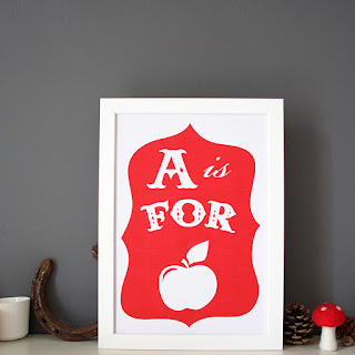
So I've had an overhaul of my alphabet risograph prints. The old ones are taken against a white background, using lights, which I thought were great at the time, but natural light is so much better. It was fun to do a bit of styling with props too, I think the new shots have a much warmer feel to them. What do you think?
I used the Crafter's Guide to Taking Great Photos by Heidi Adnum, I'd really recommend this book if you're keen to learn a bit more about product photography. Of course, there are loads of online guides, but I like having a book to refer to! All my prints are available online, and from my bricks and mortar shop at the Craft and Design Centre, which is also having an exciting face lift!


